A quiet revolution, a renaissance, has gone on in Bible design in the last decade or so. Have you noticed?
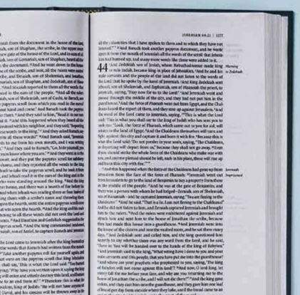
It used to be that nearly everyone at my church had a Bible that looked like this, and hardly anyone seemed to mind.
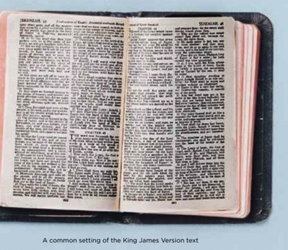
But ask yourself a few questions, and you might suddenly find yourself minding after all. Is this double-column format, where every verse is its own paragraph, really the most conducive layout for contextually sensitive Bible reading? Are all those superscript numerals and letters actually helping people understand better what they read? Why are the shapes of the letters on the page kind of muddy and dark? And why is all the text so cramped?
Now look at the beautiful new Lexham English Septuagint, whose design I and other Lexham editors modeled after prior work by Crossway in certain of their ESV editions: The text is set in a single column, making the Bible look less like a reference work and more like a text meant for reading.
The text is paragraphed, helping readers trace the thoughtflow of the biblical writers—and helping them avoid the dangers of lifting single verses (which weren’t even invented until 1550) out of context. The typeface is tasteful, elegant, weighty, and clean. The poetry is carefully broken up into indented lines so that the Hebrew parallelisms are clear. The page design marries beauty and truth, if I do say so myself.
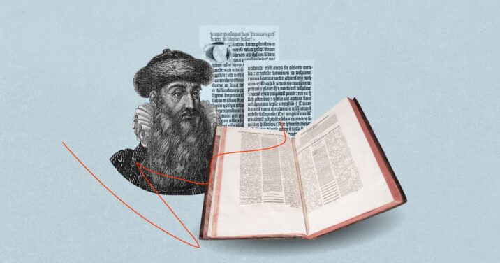
Beautiful Bibles aren’t new. Look at the first printed Bible ever, Gutenberg’s famous 1454 edition of the Latin Vulgate:
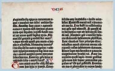
It has always been remarkable to me that Gutenberg’s work looks so polished, given that his Bible was the first ever printed book in Europe. But it didn’t spring from nothing; it was the culmination of the hand-lettering traditions of the Middle Ages.
Bible design, in other words, has had its ups and downs. It’s currently in an up.
Bible designers
Klaus Erik Krogh is the man you’ve never heard of who may be more responsible than any other single person for the recovery and advance of the Bible design tradition in our day. Check the flyleaf of your nicest and newest Bible; just see if his company 2K/Denmark doesn’t appear there.
I talked with Klaus in his Denmark garden; I also reached out to Adam Lewis Greene of the famous Bibliotheca Kickstarter project, Melinda Bouma of Zondervan Bibles, J. Mark Bertrand of the Bible Design Blog, and Josh Dennis of Crossway (all interviews but the last are available on YouTube). Every one of these individuals has made major contributions to the renaissance of Bible design.
I want you to hear from these gifted people. If you’re still reading a double-column Bible exclusively, if you’ve never known to care about good Bible typography—then let these gifted Bible designers persuade you that you’re missing something.
Klaus Erik Krogh of 2K/Denmark
“The best way to describe what I do,” Krogh says, “is just leading this wonderful team of people to try to make beautiful Bibles that are readable and clear—to help remove barriers so that people can experience God through His Word.”
But this is just what Bible designers who made not-so-beautiful Bibles 30 and 80 years ago said. How did we, the Bible-buying public, let ugly Bibles happen?
Klaus says, “I think that over the years, readers—and then publishers who heard it from readers—were trying to get smaller, more portable Bibles. And to do that, oftentimes, [they chose] fonts that were efficient [but] not always also beautiful.”
Klaus knew, however, that well-designed type could be beautiful and efficient. Klaus told me that the amount of paper his team is able to save publishers more than pays for his team’s type-design costs. He also told me that while it was once difficult to persuade Bible publishers to use services like his, it is difficult no longer.
Adam Lewis Greene of Bibliotheca
And one of the major reasons for that change is Adam Lewis Greene—the Klaus Erik Krogh of America (the best Bible type designers all have three names). Greene’s work on the famous Bibliotheca Kickstarter project made Bible publishers sit up and take notice.
As a graphic designer and Bible lover, Greene always wanted a “reader’s” Bible, one that presented the text of Scripture in its purity, with no chapter or verse numbers. “In the years even leading up to the project, I was just waiting for something like that to come out,” Greene says, “because I couldn’t believe that it wasn’t readily available.”
Greene was inspired by the work of theologian N.T. Wright, who helped him see the Bible as a unified whole, and by the work of linguist Robert Alter, who helped him appreciate the artistry of the Bible’s distinctive literary genres. Greene also consciously relied on centuries of writing on typography, from Eric Gill of the 1800s to Robert Bringhurst of our own day.
Greene produced some beautiful Bible mock-ups, his friend shot a stirring promotional video, and soon a few Kickstarter orders started coming in. Greene had a wild dream that he might attract 500 backers who would commit the $37,000 he felt would enable him to produce some nice-looking Bibles at cost.
Instead he got 15,000 backers who pledged $1.4 million. This enabled Greene to lavish attention on the five-volume Bibliotheca set. Dyed linen covers, exquisite paper, a custom typeface, a scholar-vetted update of the (public-domain) American Standard Version—Greene pulled out all the stops and then invented new stops just so he could pull them out.
Greene sees room for reader’s Bibles and reference Bibles in people’s Bible study libraries. “I think a lot of people have misinterpreted Bibliotheca as a [rejection] of the reference Bible. … [But] that expression [of Scripture] is what kept the Bible alive and widely distributed over centuries.”
Melinda Bouma of Zondervan Bibles
One of the people who took notice of Greene’s success was Melinda Bouma, Vice President and Publisher at Zondervan Bibles. She told me, “When we saw how many people were willing to sign up and pay for that beautiful expression of that Bible—which was not an inexpensive Bible—that got [our] attention. Maybe people care more about that detail in their Bibles than we knew.”
Prior to that time, Melinda said, Zondervan was “not hearing [from readers], ‘Please give us better fonts, please give us better paper, please give us better craftsmanship.’ ” But Bibliotheca showed Melinda and her team that “there are people out there who care about [Bible design] as much as we do.” Indeed, you can’t talk with Melinda about Bibles for a minute before you see how much she cares. “People … are in Bible publishing,” she told me, “because we love the Bible.”
After Bibliotheca, Melinda tried to reach out to Klaus Erik Krogh, but 2K/Denmark’s website at the time was in Danish. Finally, at a conference, she got to sit with him in person. And their work together has produced lines of Premium Bibles and the custom, translation-specific typefaces.
J. Mark Bertrand of the Bible Design Blog
Technological developments in desktop publishing and printing had to take place for Bible design to become what it is today—everyone I talked to mentioned this. But computers don’t understand beauty. It still takes people, made in the image of a God of beauty, to execute good designs—and promote them.
Enter J. Mark Bertrand of the Bible Design Blog. With nerdy writing and lush photography, Bertrand has been able to both popularize and advocate for better Bible design. Bertrand is a pastor, a novelist, and a lecturer on Christian worldview. Bertrand doesn’t promote one publisher over another. He thereby helps float all boats.
Bertrand speaks in tidy paragraphs, and in my conversation with him he observed that in the past, “people expected the Bible to look the way that it looked—like a reference book.” But, he says, “it’s become easier for us to make the book look like a book—meant for reading and not just for looking things up.”
Because I work for a company that makes Bible software, I was especially interested to hear Bertrand point out that a lot of the reference elements that were present in Bible designs of the past are no longer needed. “Now we’ve got all that stuff on our phones,” he says. “I’ve seen a huge shift in the attitude of ordinary people in terms of what features their Bible needs to have. … People are much more accepting of reader-friendly editions than they were even 10 years ago.”
Josh Dennis of Crossway
No one in the Bible design space lives on a Bible design island. All learn from others. But if I had to pick the most important influence in Bible design in recent memory, it would be Crossway, publishers of the English Standard Version. Crossway’s commitment to beautiful and plentiful ESV editions has raised the bar for Bible publishing and helped establish the ESV at the same time.
Crossway’s Bible designs have always befitted the character of Scripture, and their choice of the typeface Lexicon—see sidebar—for many of their most important Bibles was (almost) inspired.
Crossway’s new president, Josh Dennis, has long had a hand in Bible design at the company. He thinks practically: “Everyone wants a thinline, compact, large print Bible,” he says, “complete with maps, study notes, and, of course, wide margins. But there’s a reason that edition doesn’t—and can’t—exist.” But Dennis also thinks aesthetically—along with his late grandfather, the ultimate founder of Crossway, who said that “the best message in the world is worthy of good design and typography.”
Digital Bibles
There is so much more to talk about in Bible design (time would fail me to tell of Bible rebinders such as Leonard’s, smaller Bible producers such as Schuyler Bibles, and Bibles outside of the evangelical space I personally understand best); but I cannot close a piece on Bible design without mentioning digital Bibles.
Digital Bibles, too, have come a long way since I first encountered them in the late 1990s. One of the reasons I personally chose Logos over competing software—I’m not kidding; this is really the way I think—was the elegance of their type design. I can’t read lots of text in Arial; I can’t. I won’t. One of Logos’s longtime user-interface designers, Eli Evans, told me that they chose the typeface Athelas because it was scholarly and managed to look both to tradition and to the future (Logos also lets you choose Arial instead if you insist on being a Philistine).
The Logos Hebrew and Greek fonts were custom designed, in part in house, to harmonize well with our roman characters. And unlike paper Bibles, Logos allows me to turn features on and off. I regularly turn off verse and chapter numbers, for example, to read only the Bible text with no intrusions.
Bible typography matters
Many things matter more than Bible design—but it does still matter, and it matters because it means. The shape of type on the page, from the letters to the paragraphs, sends messages we do receive and process, whether we think of it or not. We might as well think about it, of course, but the beauty of the Bible design renaissance I’ve described is that many people who will never think about typography will still get great Bibles made by people who do.
***
This article was originally published in the November/December 2021 issue of Bible Study Magazine. Slight adjustments, such as title and subheadings, may be the addition of an editor.
Related articles
- The Definitive Guide to Bible Commentaries: Types, Perspectives, and Use
- Can We Trust the Bible? The Resurrection Says Yes
- 7 Things about the Bible I Wish All Christians Knew
Related resources